The Parts of a Perfect Product Page
Intro
If you are selling goods or services direct to an end-user consumer then the product landing page is a crucial aspect of converting interest into dollars. Perhaps you are even aware of your metrics, looking at total web sessions compared to page and add to cart views. You want to increase conversions and are open to trying anything that will help your product pages attract buyers. Yes, digital merchandising is always improving, but you shouldn’t randomly or aimlessly add new page elements. Online retail isn’t trial and error. Instead, we must remember that there are a few tried a true fundamentals of a product display page. In this article I review the parts that make a perfect product page, providing tips and examples of companies who do these aspects exceptionally well.
Parts of a Perfect Product Page
Quality Content
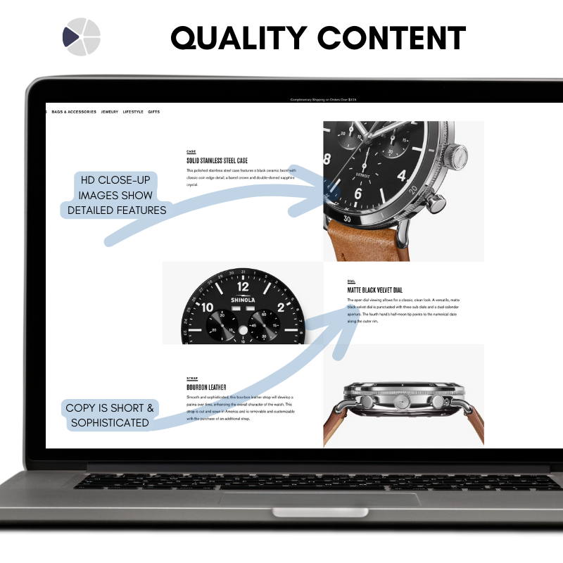
Content for product landing pages typically includes images, videos and copy. Videos can help demonstrate the exact solution you provide and showcase or train how to use it. Copy, the words on the page, is important to quickly inform, convince and convert prospective customers. You need high quality, good looking images of your product to best highlight what stands out with your offering. You cannot skimp on quality content. Doing so will result in a cheapening of your offering and turn away customers expecting professional products and services.
Tip: Look over you content pages and ask what can be removed from your copy. Look to simplify as much as possible, finding easier ways to communicate the information. Every word, photo and video should have a unique purpose to being included.
Value
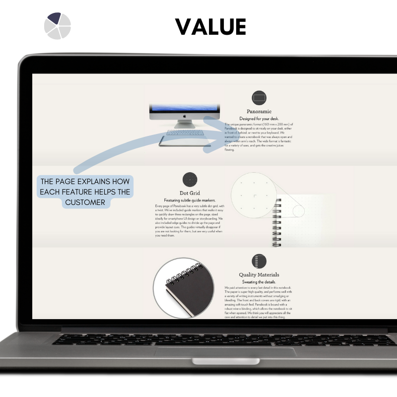
The nice photos we use, the words we choose and the videos we create should both be professional quality and serve the purpose of highlighting value. Something about your product stands out from the competition. By using your product the customer’s problems are somehow solved. Their life is more enjoyable with the your widget in hand. At the heart of every sale is a customer who is convinced that spending money on something will create some kind of value for them. The perfect product page makes direct mention of this. It’s more than the quality of the content, it’s about by positioning that material to tell the story of the benefits it provides a buyer. Not just listing specs. But connecting specs to meaning.
Tip: review your product pages. Anytime a feature is mentioned critique how it showcasing the benefit or value to the customer. Ask yourself what that feature means for someone using your product and discern if your page adequately makes that connection.
Purchase Details
The price of an item is a no brainer inclusion on important parts of a product page. However, purchase details go beyond price alone. Purchase details include the price, availability, additional fees, promotional discounts, and include an estimated time of customer arrival. Purchase details can also include payment options and services like the virtual wallets and financing programs. Purchase details include the add to cart and checkout. These details serve to legitimize the listing and answer the most import questions for a customer. How much is this solution going to cost me? How can I pay for it? When will I get it? How do I buy?
Tip: Consider answering the following questions to review the purchase details on your product pages:
Does your competition offer payment plans and wallets you don’t offer your customers?
Are customers asking or providing feedback indicating they wish to pay using different methods?
Do you get pre-sales questions that could be answered on the product pages?
Do customers place orders and use the comment field to inquire about availability or estimated arrivals?
Example:
Sweetwater is an e-commerce musical instrument retailer. Buying guitars in a brick and mortar store has benefits vs online sales, because you can see first hand the exact guitar you’ll buy. Sweetwater overcame this by using specific purchase details. They show the serial number of the guitar with matched photos. Buyers are confident because they know exactly what they are purchasing.
Advocacy
Reviews and testimonials are a proven way to increase conversion on your product pages. The reason is simple purchasing psychology. Of course a company believes their product is the best ever. But what do the customer say? Reviews, (positive ones) enable a company to answer buyer’s questions without being the biased party. By showcasing your reviews you are answering why people like the product, how it helps customers and what their shopping experience was like. Reviews enable sales without the customer having to take the sole opinion of the company making the product.
Tip: Monitor the reviews of your products across platforms where you sell. Perhaps you already have a database of reviews that can be showcased on your site. Drive more reviews by sending feedback surveys to customer who have bought directly from you. Great products get great reviews but you do need to ask for them.
Example:
YETI builds coolers with a simple mission in mind: build the cooler that would be used every day. They lean heavy on their loyal fans and showcase their positive reviews throughout their website. Listed alongside the important purchase details, a curious shopper can click the reviews and quickly read what past shoppers said.
Trust
A product display page typically exists to result in a sale. Anytime money is involved, some degree of trust is needed. Even subconsciously, shoppers are aware of fraud and need ensured a sale is legitimate. This is especially true of first time buyers and visitors to your site. An important part of a product landing page is the trust signals you send to a customer that assures them they are making a good choice. Trust signals can be a secure checkout, satisfaction guarantee or brand promises. They are signs to your customer that they do not need to worry about opening their wallet and purchasing from you.
Tip: Review the sites you often buy from. Or, shop for an item and view multiple retail pages for the same item. What stands out amongst the high quality pages that build trust?
Summary
I hope this article provided inspiration and creative ideas that can be applied to your product display pages. As you review your offerings, think through these different parts. Ask the team to spend time on product pages and solicit opinions on what can be improved. Small improvements can have a big impact on a customers experience and ultimately lead to increased conversions.
If you want to talk more about your product pages and increasing conversion, get in touch with me. If you enjoy helpful articles like this, subscribe to my newsletter where I send our insights aimed to help any business leader.


